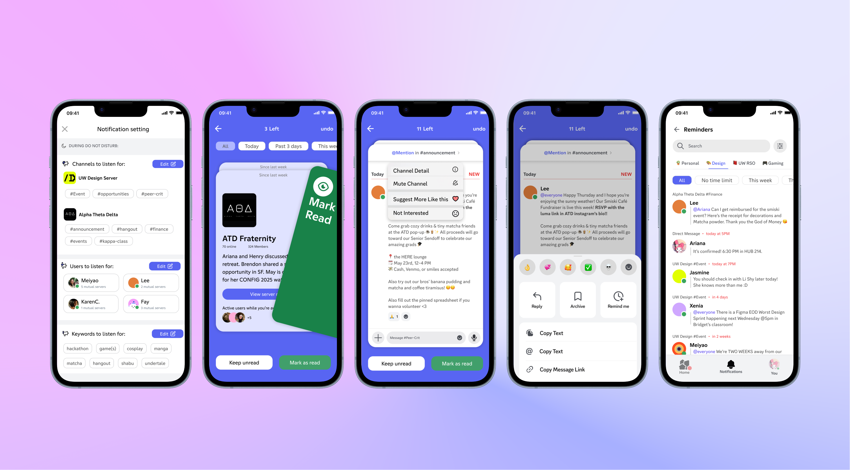
Discord Notification Redesign
A redesigned Discord notification system that empowers non-technical community members to catch up effortlessly.
The Modern “Do Not Disturb” Dilemma
“Do Not Disturb” offers peace, but at a cost: the gradual erosion of belonging.
Re-entering a community can be overwhelming: missed inside jokes, lost context, and the quiet anxiety of FOMO… “am I missing out the fun?”
In active Discord communities, members struggle with staying informed, either feeling glued to servers or returning to irrelevant noise after being away.
Not Just For Gamers
Discord has expanded beyond its gaming roots, becoming widely adopted by non-gamer communities — tutoring, networking, hobbies, content creator fanbases.
Although Discord invested in playful, beginner-friendly visual branding, its Mobile UX still feels intimidating for newcomers with low technical fluency.
Steep onboarding curve, folder-based navigations, and unpredictable (sometimes invisible) system behaviors can create frictions & discourage prolonged engagement in communities. Our redesign vision is to optimize the mobile UX to align with Discord’s inviting rebrand.
Non-technical Community Members
- Main information source for events like fundraising, meetups, and community updates.
- Not familiar with advanced search, bots, or folder structure.
- Busy, don't chronically online, but still want to keep up with community updates.
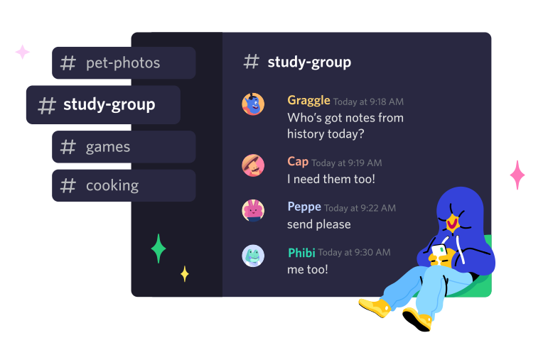
How might we help non-technical community members catch up on notifications effortlessly?
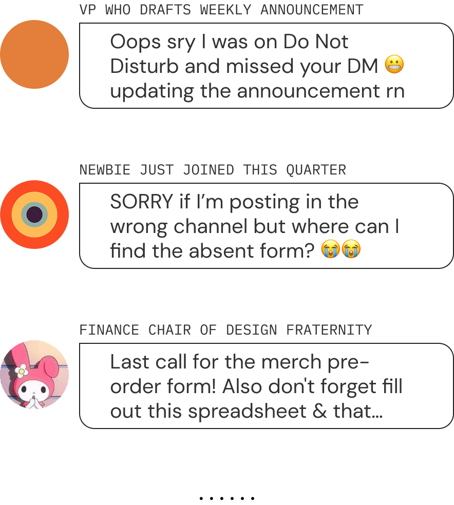
We mapped this opportunity through a scenario with an executive board member of a college design fraternity. They juggle weekly announcements, event coordination, fundraisers, and new member onboarding…
all while keeping up with the spontaneous social energy that makes the community special.
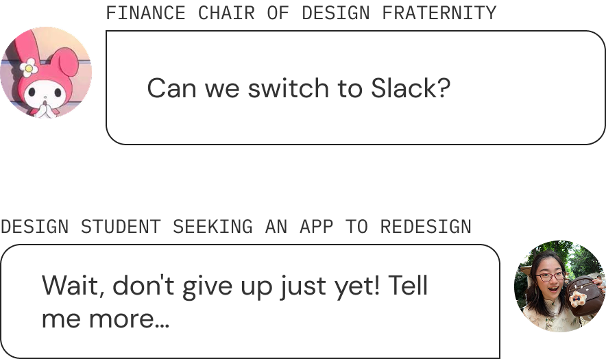
One board member finds herself craving the structure and clarity of Slack when it comes to managing a growing community.
When she tries to focus on school work or enjoy personal downtime, her Discord beeps non-stop for @mention from irrelevant servers.
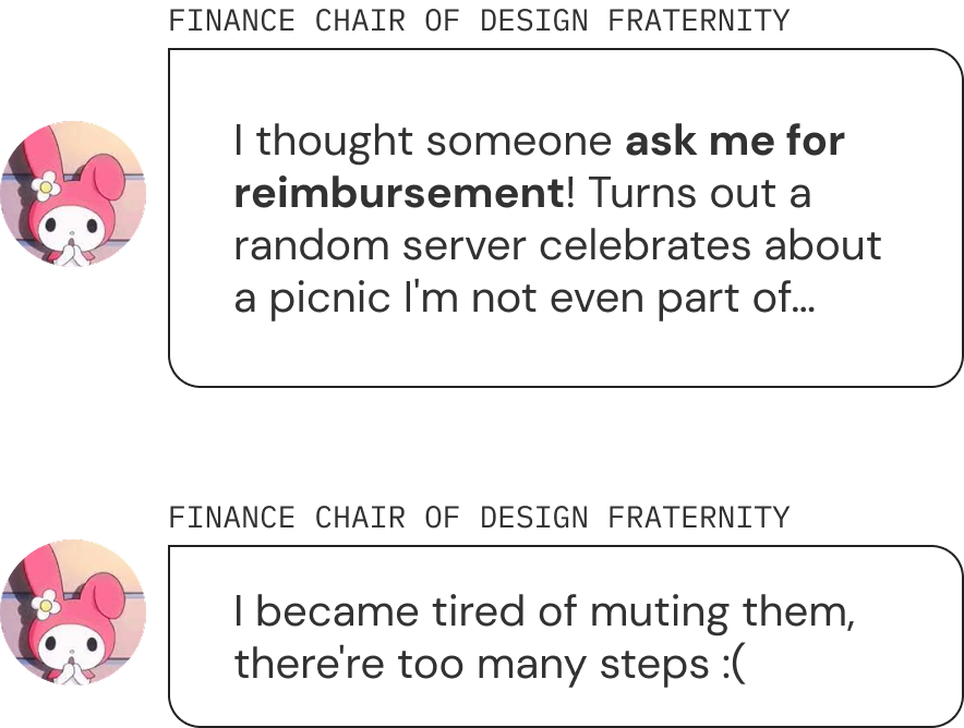
When she returns to Discord after being away, she feels overwhelmed by a flood of unfiltered messages and cluttered homepage.
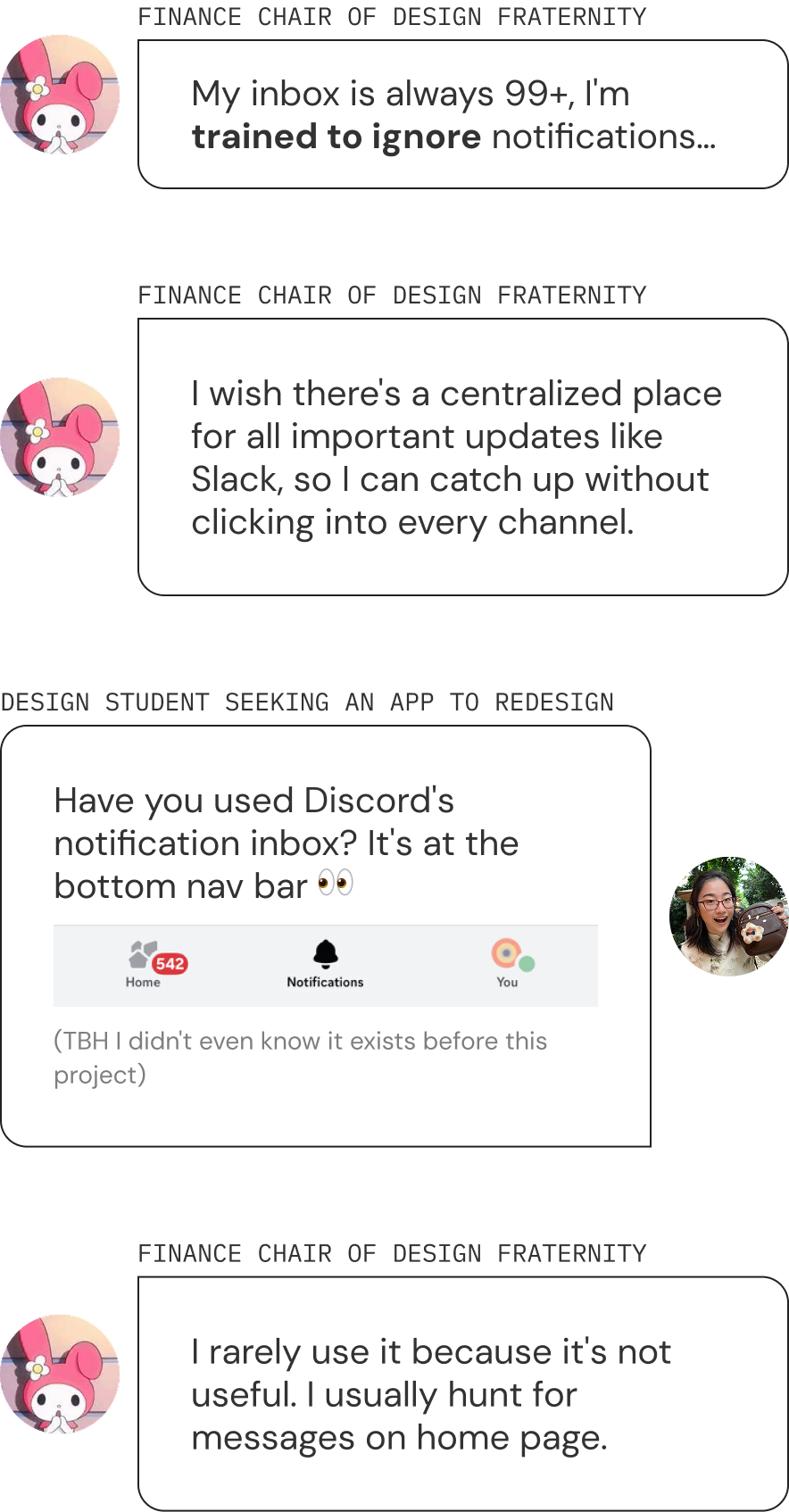
Discord’s Notification System Doesn’t Scale with Community Complexity
Patterns we found from developer forums & Reddit.
- Low Signal-to-Noise Ratio: Important updates are buried in spam. Scrolling chat history to find what matters is exhausting and unreliable.
- Phantom Beeps: No visual cues or accurate notification history. Users are forced to check every server and channel just to trace where a notification came from.
- No Middle Ground: To regain control, users must mute all servers entirely. No keyword whitelisting or granular controls are available.
What Can We Learn From Slack?
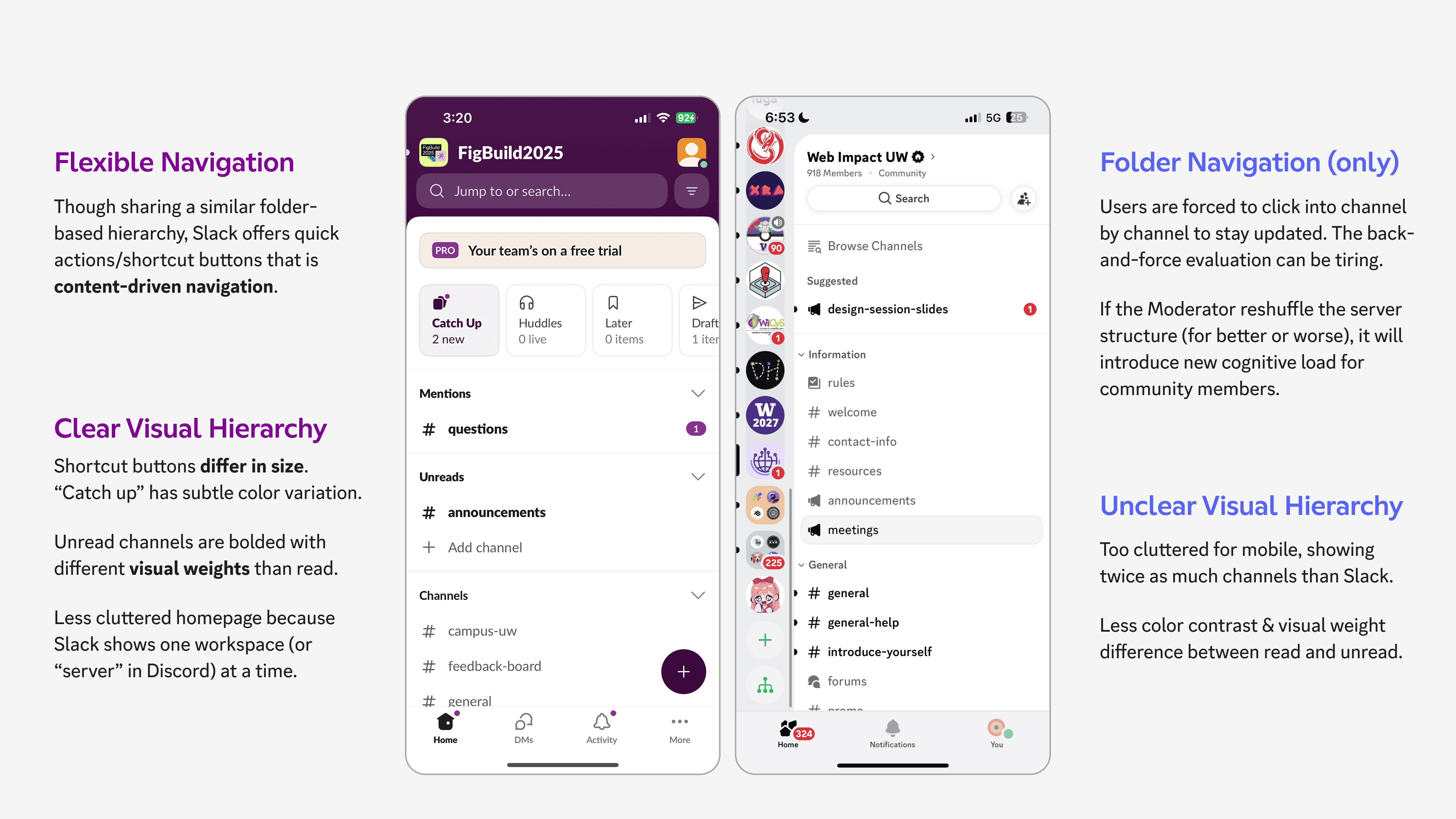
Slack shows one workspace at a time, whereas Discord manages 10+ servers simultaneously. Yet Discord’s notification filtering tools are far less robust.
Slack’s filtering tags & concise message sources reduces information overload. It shows two-lines preview, short enough to fit more messages, long enough to provide actionable context.
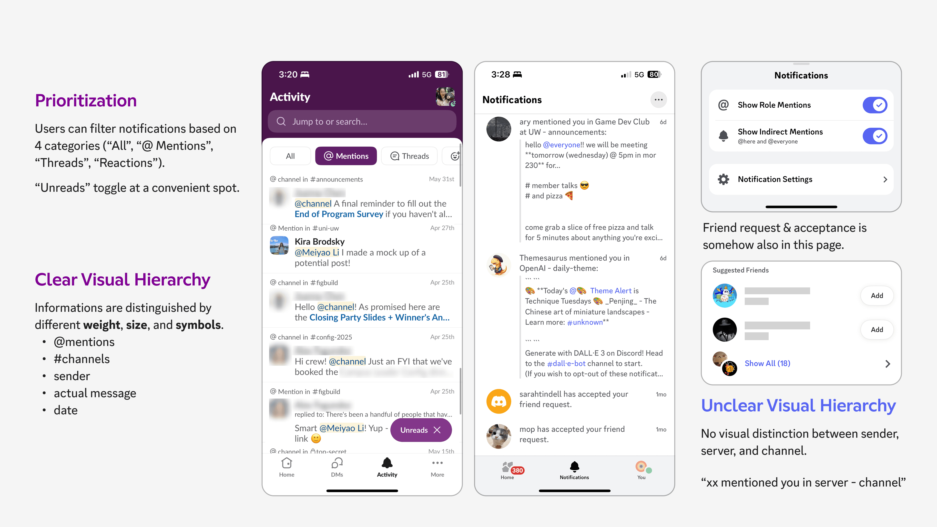
What if users can filter by server or even subscribed channels? There must be a better approach than just dumping ALL notifications in one page…
Redesign Goals
Alternative Navigation
Bypass hierarchical, folder-based channel lists with a shortcut for quick catch-up.
Notification Inbox
Improve visual hierarchy to support Discord’s multi-server scale and surface what matters.
Notification Settings
Interest-based whitelisting that gives users control over exactly what enters their inbox.
How to Communicate Multi-Server Hierarchy?
Although it was tempting to copy Slack’s card logic directly, we had to respect Discord’s multi-server complexity.
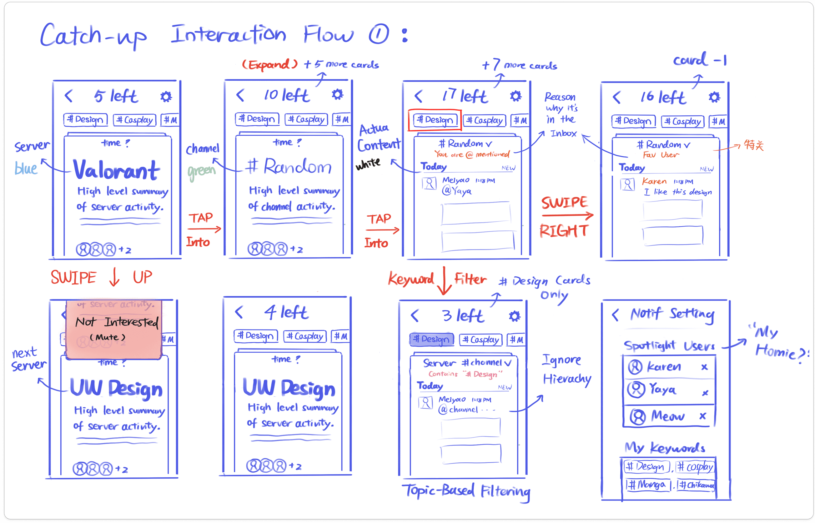
I sketched out change in states to visualize edge cases, this helps me get productive critiques before I implement them in Figma.
Although I was proud of figuring out the blurs & parchment paper effect, they add more distraction than value—imagine watching this animation for 100+ messages!
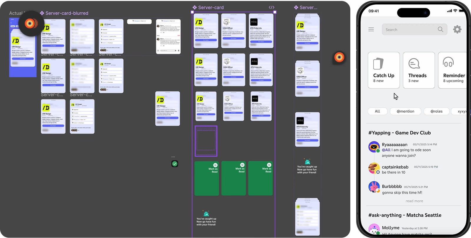
As I observe users testing out this prototype, I also realize the intermediate state disrupts the swiping flow. They need to stop and ponder—“what message should I click into?” and this problem is exactly the same as deciding which channel to click into.
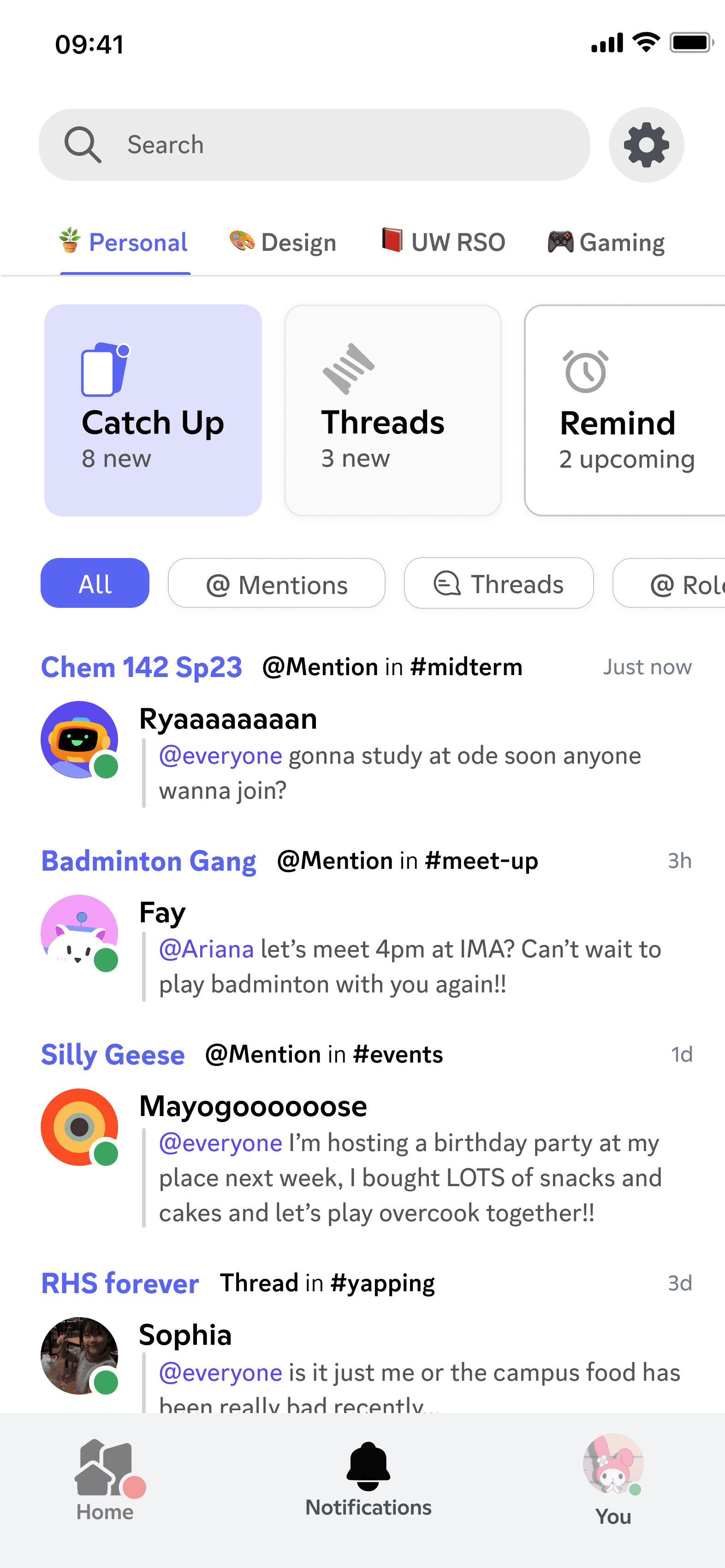
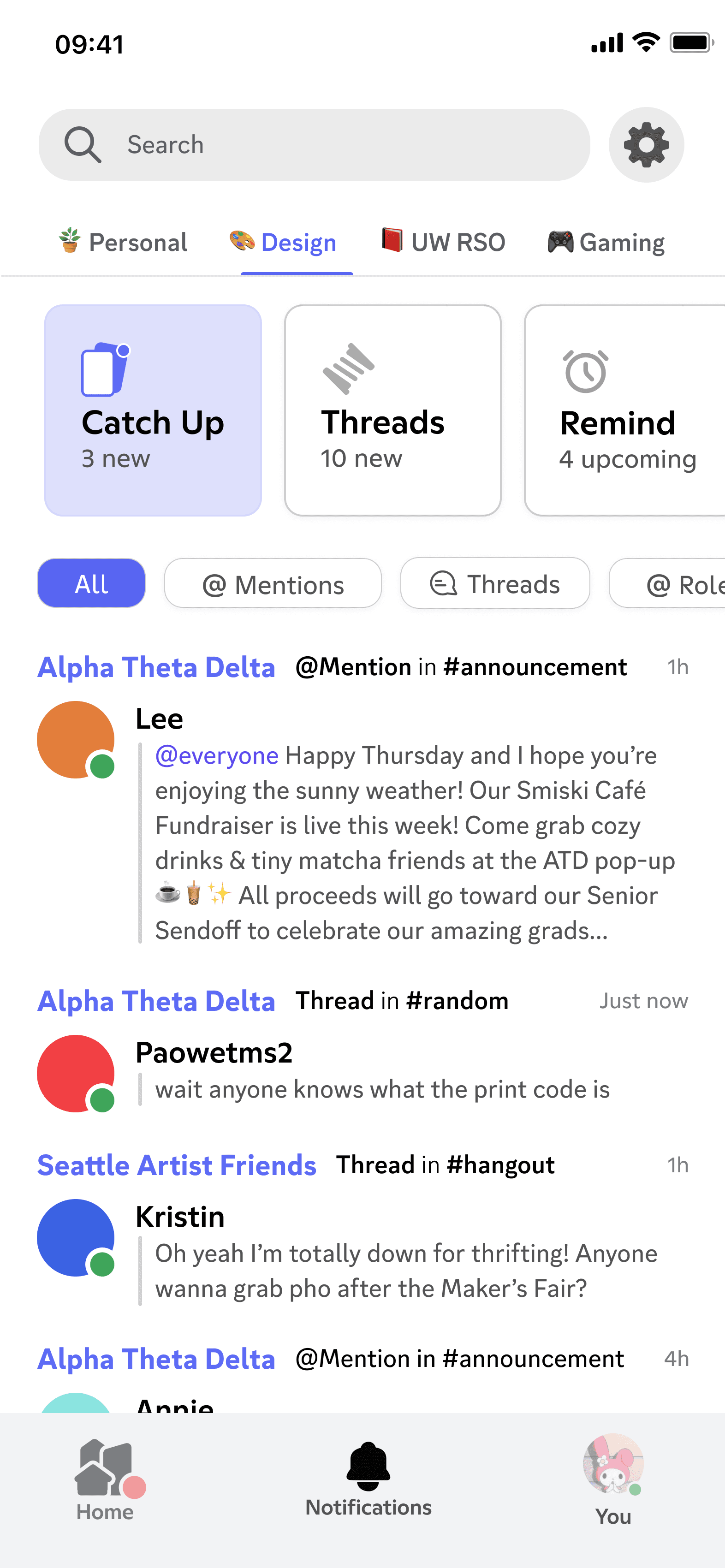
How might we accommodate users across usage level (3 ~100+ servers)? We think Slack workspaces (one catch-up view for each server) feels too separated, its constant role-switching doesn’t match the fluidity of Discord. Through observations, we found out users are already grouping & color-coding servers. We can borrow this user-defined category as a middle-ground solution.
A smart, interest-based notification inbox.
(Click screen to switch to dark mode!)
Success Metrics
1) usage frequency of notification inbox WRT homepage as notification entry point = improved discoverability & user trust
2) Drop in channel-switching bounce rate & idle time on homepage / channel list, paired with increase in time spent within chat interface = reduced navigational friction, locate content efficiently, spend more quality time w/ friends.
(Click screen to switch to dark mode!)
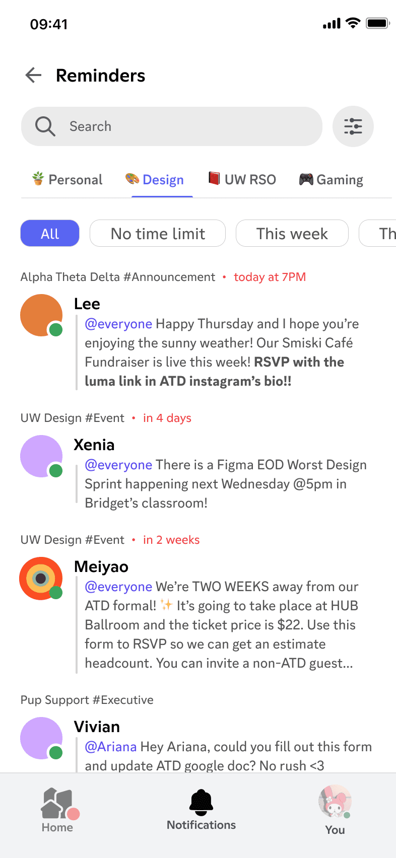
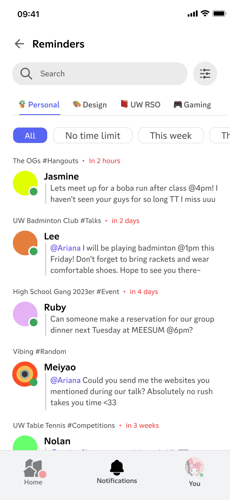
(Click screen to switch to dark mode!)
Success Metrics
1) usage frequency of notification inbox WRT homepage as notification entry point = improved discoverability & user trust
2) Drop in channel-switching bounce rate & idle time on homepage / channel list, paired with increase in time spent within chat interface = reduced navigational friction, locate content efficiently, spend more quality time w/ friends.